Recently I was invited to give a keynote talk as part of the research week at the Open University of Catalonia. Founded in 1994 it was the first fully online university. As you can imagine they have seen a lot of changes in the way people learn online and asked me to speak about Visitors and Residents (V&R) as a useful way of understanding online engagement. This gave me the opportunity to gather together some of the various uses of the idea that myself and others have developed.

UOC did a nice job of videoing my keynote talk (if you have plenty of time – if not then read on)
[embedyt] http://www.youtube.com/watch?v=eUH-FrPyBqc[/embedyt]
You can find out about the ‘standard’ V&R mapping process here which is an effective method of making visible individuals’ engagement online. This process has been used by people in various contexts globally with one of my favourites being by Amanda Taylor with Social Work students. This starts from the principle that if we now, at least in part, live online then Social Workers need to be present in online spaces (or at least understand them as somewhere people are present).
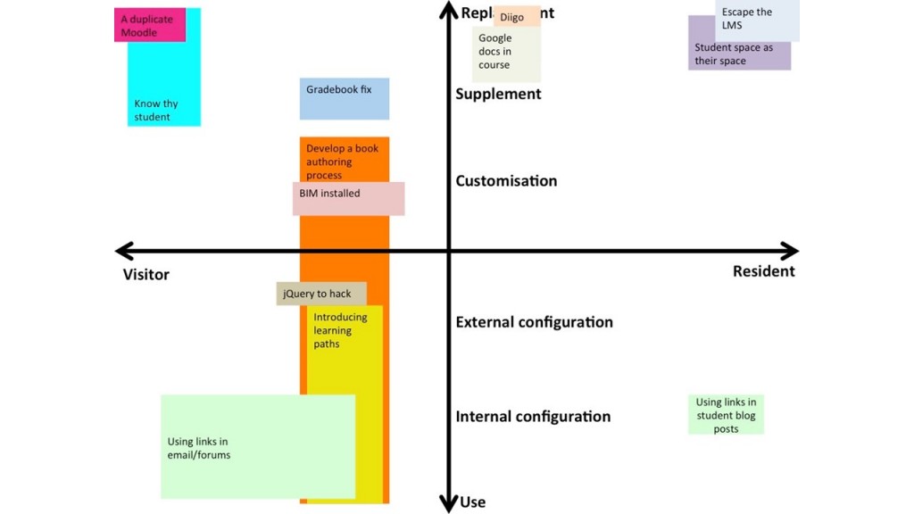
Another interesting use of the basic mapping has been undertaken by the Mapping the digital practices of teacher educators project run by Peter Albion, Amanda Heffernan and David Jones. In an award winning paper they describe how they used a vertical axis on the map running from “Use” to “Replacement” to get teachers to map where they have used institutional platforms as they were intended and where they have reconfigured, customised or replaced them. This is a great way of mapping the actual practice of an institution rater than assuming the technology is only being used along ‘official’ lines.
From the paper presented at SITE’2016. One of three papers awarded the Ann Thompson TPACK Paper Award.
Authors: Peter Albion, Amanda Heffernan, David Jones
The standard mapping process has also been used extensively by Lynn Connaway and colleges to explore how students engage with university services. A really interesting technique they are using is to extract each online tool/space to see how broad the modes of engagement are in specific groups. (The following slides were part of a presentation at the OCLC Global Council meeting, Building Our Future, April 12, 2016, Dublin, Ohio.)
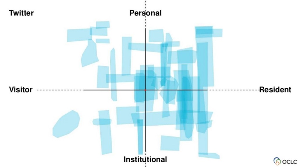
Note how Twitter maps across all four quadrants, not just the Resident side of the map.
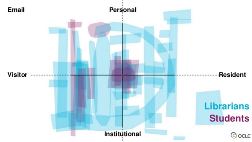
Here we can see that these students engage in email in a far narrower, less present, manner than the librarians which gives a useful insight into the manner in which the library should engage users online.
OCLC are also developing an online V&R mapping app so that individuals can map digitally and the maps can be more efficiently analysed.
—
This is where I come back to the “Truth and Method” title which is a reference to work by the philosopher Gadamer which Anthony Johnston, a colleague at UAL, recommended. It highlighted for me the tension between understanding practice individual by individual (Truth) and trying to uncover larger trends or themes across groups (Method). The mapping process originated as an activity for a conference session on the original V&R project. It’s gradually evolved down a number of branches into a research instrument designed to inform institutional strategy and policy. The work Lynn and OCLC is doing gathering together maps of specific services is a good example of how the process can be used to highlight trends.
Another good high-level (Method) modification of the mapping process has been designed by Lawrie Phipps for Jisc. This is a ‘group’ or ‘institutional’ mapping process which has been used in a number of workshops (some run with the help of myself and Donna Lanclos) to help staff gain an understanding of the digital ‘landscape’ or identity of there institution.
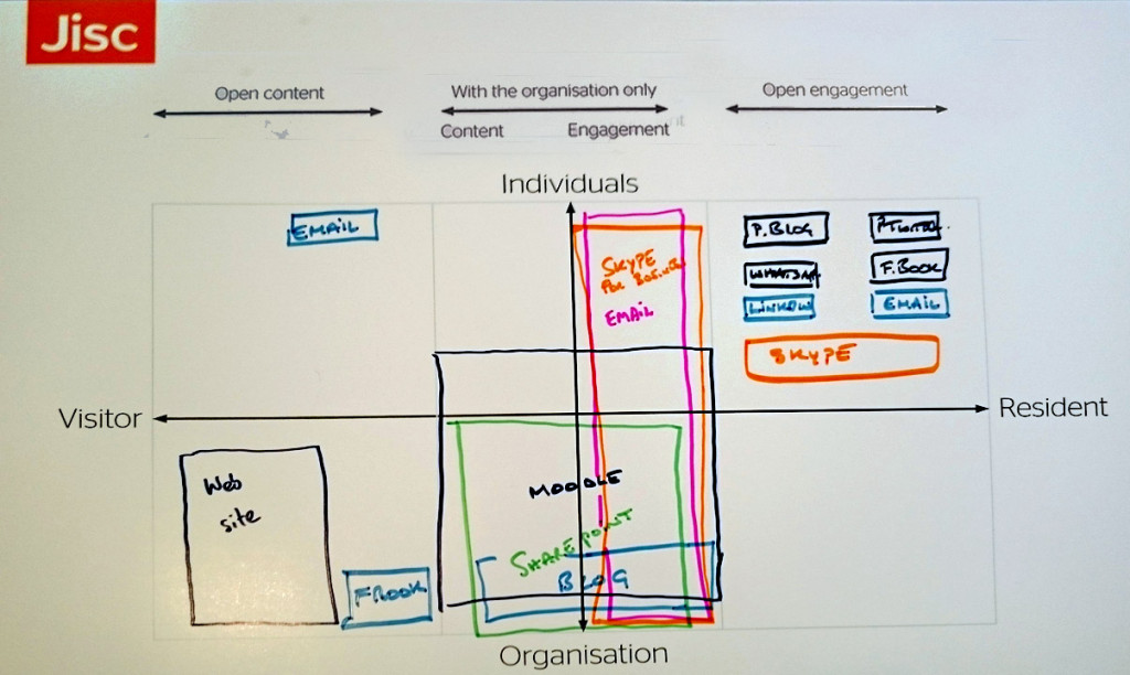
I was lucky enough to attend a packed workshop on this at the Jisc digifest in March. The process works well, highlighting the balance between open content, stuff you need an institutional logon for and open engagement. In Lawrie’s version Visitor and Resident is swapped out for Broadcast and Engage which broadly map to V&R in principle but are a little more direct for folk who think along institutional lines. Significantly, the vertical axis is changed to Individual and Group to capture the location of identity the activity is linked to. For example, the main university website vs a individual academic on Twitter talking about their work.
Jisc will be releasing detailed guides on running strategic V&R mapping workshops which include both the individual and group mapping formats.
—
The art in research terms here is to develop methods which reveal larger trends across groups without sacrificing the ‘truth’ of individuals’ personal practices. It’s certainly the case that Web provides an environment where individuals can develop practices and modes of engagement which reflect their aspirations and context in an highly personal manner. Every V&R map is different and everyone who maps can describe in detail why their map is a particular shape.
Given that I’m wary of approaches which aim to take rich, qualitative data, and turn it into bar graphs. Sometimes numbers create a false truth, or perhaps I’m suspicious because I see numbers being used as if they are ideologically neutral. For example, we undertake interviews then code them and turn the coding into numbers. These numbers are then presented as a successful ironing-out of the idiosyncrasies of any given participant and any of our potential bias as researchers – is that really the point? In Gadamer’s view this would be Method winning out over Truth. Nevertheless we can’t respond as institutions on an individual by individual basis so we have tread a delicate path towards larger trends.
My first attempt at this was to layer maps and create what I though of as a heat-map of a given group:
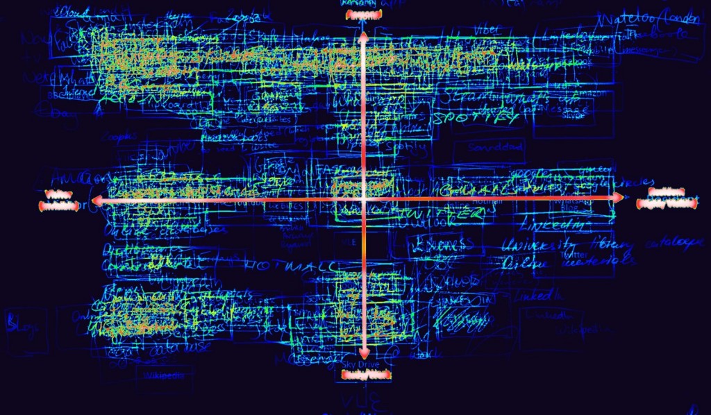
This one is of around 20 MBA students. It works ok because they all happened to map in a similar manner so you can see group patterns in the modes of engagement. The process is less effective when everyone is mapping in their own style. For example, how could you include the map below in a layered heat-map?
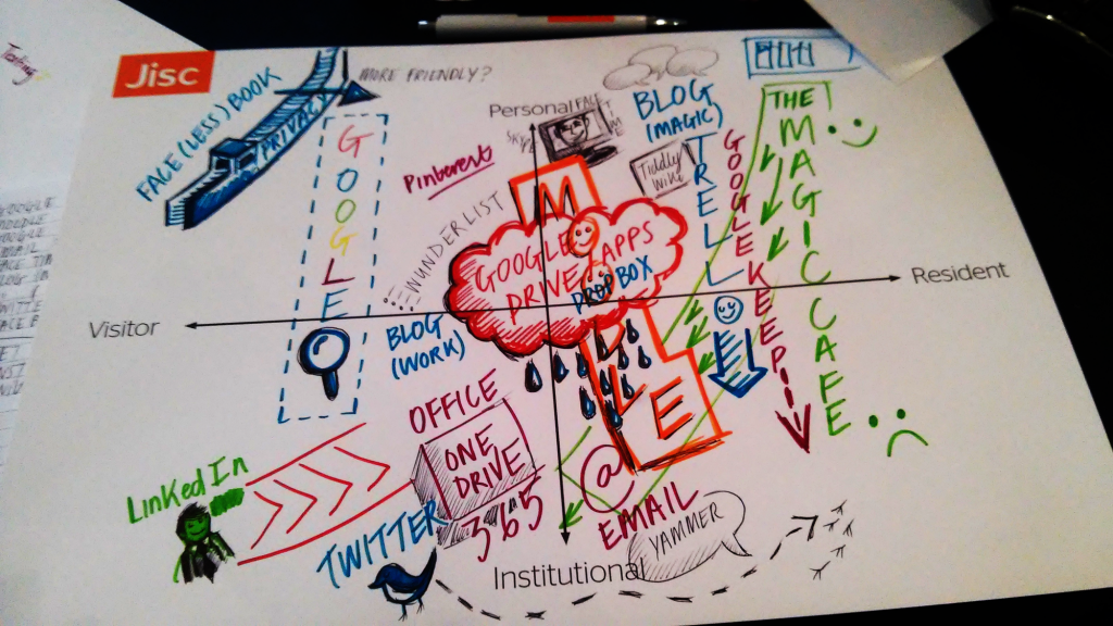
So in attempting to create ‘accurate’ layered maps I was in danger of trying to smooth-out the charismatic and personal nature of them. You’d have to give people the same kind of pens and set a bunch of rules about how to map which takes away the interpretation of the process, it removes agency from the participant. This would be killing one of the characteristics of the mapping which I enjoy the most – seeing the person in the *way* they have mapped not just *what* they have mapped. In essence, the manner in which individuals approach the mapping is important data in of itself.
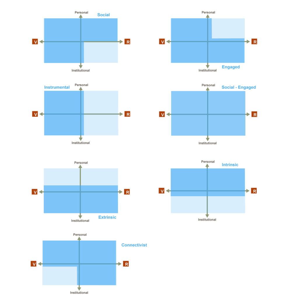
I worked with Alison LeCornu on The Higher Education Academy ‘Challenges of Online Residency’ project which involved 18 higher education institutions mapping teaching staff and cohorts of students. From this I received circa 400 maps each tagged with participant data. Sifting through the maps it appeared that they did fall into broad categories based on the quadrants which had been mapped to. This led me to propose the following ‘engagement-genre templates’
The darker blue marks out the areas which an individual would have mapped to. The names of these templates aren’t hugely helpful as they are a little reductionist but, you know, naming.. etc. For example, I don’t want to imply that someone with a ‘connectivist’ map isn’t ‘engaged’.
Having created the templates I set a colleague the fun task of reviewing all of the maps and tagging them along these lines whilst also discarding mappers who appeared to have utterly misconstrued the process (bad data). The result was pleasantly surprising – most maps do fall into one of the templates fairly neatly.
Given that we were working form a convenient sample I normalised the results into ratios to look for trends. A few key patterns did emerge and it’s possible to interpret them in a manner which resonates with the narratives of higher education. We are currently writing up an open access paper on this so I won’t go into detail here.
One highlight worth mentioning in passing is the distribution of age ranges that had a ‘Social-Engaged’ map. This is a map in which there is activity in all four quadrants. The temptation might be to think that this form of map would skew young but the results show a fairly even spread of ages.
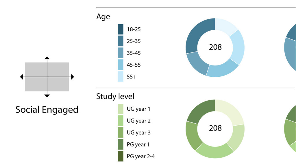
This is the age bracket and educational level of the 208 ‘Social-Engaged’ maps in ratio form. Both these categories show even distribution, demonstrating again that age is not a significant factor in the overall mode of engagement of individuals online. What we do need to be mindful of is that the character of activities undertaken across the maps might change significantly within a given genre template which is where capturing discussion that arises during the mapping process, undertaking follow-up interviews or asking participants to annotate their maps comes in to play. Nevertheless, I’m confident that using the templates is a valid approach and strikes a reasonable balance between Truth and Method when dealing with a large body of qualitative data.Hopefully we will have the paper written on this fairly soon and can share in more detail.
Overall it’s been rewarding to see the various routes the V&R work has been taking. It’s a good example of the benefits of working in an open manner and letting an idea evolve. One of the most pleasing outcomes from this approach is the V&R Wikipedia article which, for me, is a real vote of confidence in the value of the work.
(please add, edit and update the article if you have been working with V&R – it needs work 🙂
One thought on “Truth and Method – a review of Visitors and Residents”