Category: Research

  • Digitally Enhanced Blended Learning report

    This week I was on a panel hosted at the House of Lords to discuss the launch of the Digitally Enhanced Blended Learning report. The research is from the Higher Education Commission, written by Alyson Hwang.

    Close up of red and green wallpaper with an heraldic pattern
    Very House of Lords wallpaper

    The report’s research heritage has its roots in scrutiny of online learning during Covid lockdowns but things have come a long way since then. The Office for Students commissioned a review of blended learning, led by Professor Susan Orr which was published in October 2022 which forms a basis for this new research. The key finding from that 2022 work was that teaching quality is not relative to mode:

    “The review panel took the view that the balance of face-to-face, online and blended delivery is not the key determinate of teaching quality. The examples of high quality teaching that were identified in this review would be viewed as high quality across on campus and online modes of delivery. This also applies to examples of poor teaching quality.”

    Blended learning review,  Report of the OfS-appointed Blended Learning Review Panel, October 2022

    It seemed that everything moving online during Covid had caused a culture shock and certain voices in Westminster decided that learning online couldn’t possibly as good as learning in buildings. Plus, some students were making the case that they were paying the same fees for an inferior experience.

    This was more about university as a cultural-rite-of-passage than as an educational journey, but it largely got framed as being about ‘learning’. A valid question here would be ‘which students are we taking about?’ and ‘on what basis?’. See this recent piece from the Guardian by Roise Anfilogoff, who points our that for many students university became significantly more accessible during lockdowns.

    The new report

    The Commission found that blended learning has the transformative potential to widen participation and access to higher education for all, improve equality of opportunities, and enhance learning outcomes.

    Digitally Enhanced Blended Learning Report, pg 20

    The Digitally Enhanced Blended Learning report builds on the Review of Blended Learning, adding information from evidence sessions, interviews and written submissions to support a rangy set of recommendations. The case studies root the research in current, successful, practice.

    It’s notable in how positive it is about blended learning and while there are many caveats, all the case studies and stats are upbeat. I’m sure this is an effect of asking institutions to share stories, rather than a taking a detective work approach. However, given the Covid heritage of this line of reporting it’s interesting that nowhere is blended learning portrayed as a bolt-on or fundamentally ‘not as good as’ being in physical rooms. I sense we are heading towards post, post-Covid times in quite a helpful way.

    The report covers a lot of ground, ranging from the need for leadership to the state of the ed tech market. All-in-all it’s a useful body of work to support institutional strategy and to make the case for investing in Digital Education in the broadest sense.

    Year zero

    Much of what is covered and recommended are things which those of us in Digital Education have spent many years arguing for. In this sense the report is largely describing the current start-of-play rather than presenting possible futures. Covid is taken as a kind of year-zero for blended learning which doesn’t change the value of what is being said but always feels strange for those of us who have been working in the space since the 90s.  

    The following recommendations in the report are ‘classics’ and well underway in many places:

    • The need for senior leadership roles that own and promote blended learning.
    • The need for more staff development and time to be made available in workload planning for this.
    • The need to incorporate digital literacy/capability into all curriculum to equip students for the workplace (and, I’d add, life…)
    • The need for commercial ed tech development and procurement to be more agile, and possibly collective (Open Source doesn’t get much of a look-in).

    Certainly the Association for Learning Technology community have been extremely active in these areas and are well placed to contribute to any cross-sector work.

    Asynch

    The aspects of the report which open up the most interesting areas for me are around how we might develop more nuanced models of ‘blended’ as a practice and how ‘Quality’ might then be defined. The report proposes the following model:

    Time, pace and timingSynchronous and Asynchronous
    Space Place and Platform
    MaterialsTools, facilities, learning media and other resources (digital, print-based or material)
    GroupsRoles and relationships (teacher-led and peer-learning, varieties of learning groups)
    Digitally Enhanced Blended Learning Report, pg 7

    This is a useful and useable set of categories and it’s heartening to see the concepts of space and place in there. The report goes onto suggest how quality might be overseen, or measured, in recomendation12:

    The Office for Students should establish a single, coherent approach for assessing the quality of online and blended learning as the designated quality body, ensuring that metrics do not impose additional bureaucratic burdens on the HE sector.

    Digitally Enhanced Blended Learning Report, pg 6

    This is complex and problematic because, as the report mentions, all provision is blended to a degree and so any coherent approach for assessing the quality of online and blended learning will actually be assessing all provision. Moreover, if we believe that this is about the quality of teaching (and design of provision) rather than the mode then why would we want to focus on mode? Not to mention that we already have a significant burden of regulation which the report alludes to as potentially distracting.

    The HE sector is facing a significant challenge due to the regulatory landscape’s lack of consistency and stability. This diverts resources from developing teaching practices, investing in digital infrastructure, and improving students’ experiences.

    Digitally Enhanced Blended Learning Report, pg 33

    Teaching beyond mode

    This all comes back to a knotty point that, in regulatory terms, we don’t have a workable definition of teaching that operates super to mode and can be applied across face-to-face and digital. For example, when you sift through the OfS Conditions of Registration the examples given which relate to teaching have their roots in face-to-face, ‘synchronous’ practices. There are refences to the need to use ‘current’ pedagogies in digital delivery but these are not described. As in this ‘possible cause for concern’:

    The pedagogy of a course is not representative of current thinking and practices. For example, a course delivered wholly or in part online that does not use pedagogy appropriate to digital delivery, would likely be of concern.

    OfS Conditions: B1: ‘Academic Quality’, B1.3
    High Quality Academic Experience, Cause for concern 332H (b.)

    It’s reasonable pedagogic specifics are not described given that ‘current thinking’ is a moving target. However, the side effect of this is that teaching is frequently refenced but never described, which means we fall back into a ‘contact hours’, teaching is the live stuff, way of thinking. Ultimately, most of our measures of teaching quality are proxies via student experience. There is plenty of merit in that but it contributes to the problem that our shared understanding of what teaching is (and what it isn’t) is always implied, or assumed, and never made explicit.

    The asynchronous unicorn

    Although the regulatory body provided some practical guiding principles, the metrics for assessing the quality of blended provision could be clarified to guarantee quality education rather than penalise innovative practices.

    Digitally Enhanced Blended Learning Report, pg 32

    This is important because until asynchronous forms of teaching are actually understood as teaching we won’t be able to describe the value of blended, or fully online, learning. Until ‘non-live’ pedagogies are mapped into our understanding of quality we won’t, as a sector, be able to see our own provision clearly.

    The effect being that the way in which the digital can support truly student-centred flexible provision will not be acknowledged and much progress in access and inclusion will remain ‘invisible’ to quality frameworks. This extends to the way we design contracts, manage workloads, increase student numbers and widen access. The latter being a key hope attached to the hypothetical flexibility of online and blended provision, especially for those already in work:

    Contributors to the inquiry voiced how student needs and demands are changing in line with the economy – more than ever, students are benefitting from flexible, personalised, and accessible delivery of their courses.

    Digitally Enhanced Blended Learning Report, pg 4

    As mentioned, the key here is to describe and communicate-the-value-of ‘non-live’ teaching in a mode agnostic manner. This isn’t about Digital, it’s about teaching and flexibility– it just so happens that Digital allows us to undertake many forms of ‘non-live’ teaching (whereas non-digital forms of asynchronous largely rely on a postal service).

    (aside) What do we think of when we think of teaching?

    I’d like to undertake a research project where we ask a cross section of staff and students to describe what they understand by the term ‘teaching’. I suspect views will vary wildly and worry that many of them will be quite narrow.

    What can we take from the Digitally Enhanced Blended Learning report?

    There is plenty of useful stuff here and I’m sure it will be quoted in many strategies and budget asks. It’s a useful step forward, not least of which because it reflects the reality of the majority of the sector and not some kind of Oxbridge cultural romanticism, projected out from, bricks and mortar.

    Overall, I’d ask where the investment and capacity might come from during nervous times and I’m wary of a narrative which is based on the White Heat of Technology as it’s never really about the tech, it’s about the business model. Certainly, in a sector where we are generating an ever growing staff precariat, introducing technology to make things ‘more efficient’ is likely to contribute to instability. I say this not entirely from a Marxist perspective but because I believe that meaningful teaching will always involve confident, highly capable, professionals.

    To give the report it’s due, at no point does it suggest that we should do everything with AI or something along those lines, it’s driving more of an access than efficiency agenda, but it’s focus on mode, rather than the practice of teaching could lead people the wrong way. My hope is that the constructive and measured character of this report will provide a basis for us to develop more sophisticated models of practice and quality which are not tied to mode and therefore don’t segregate digital.

  • Visualising digital practices using V&R

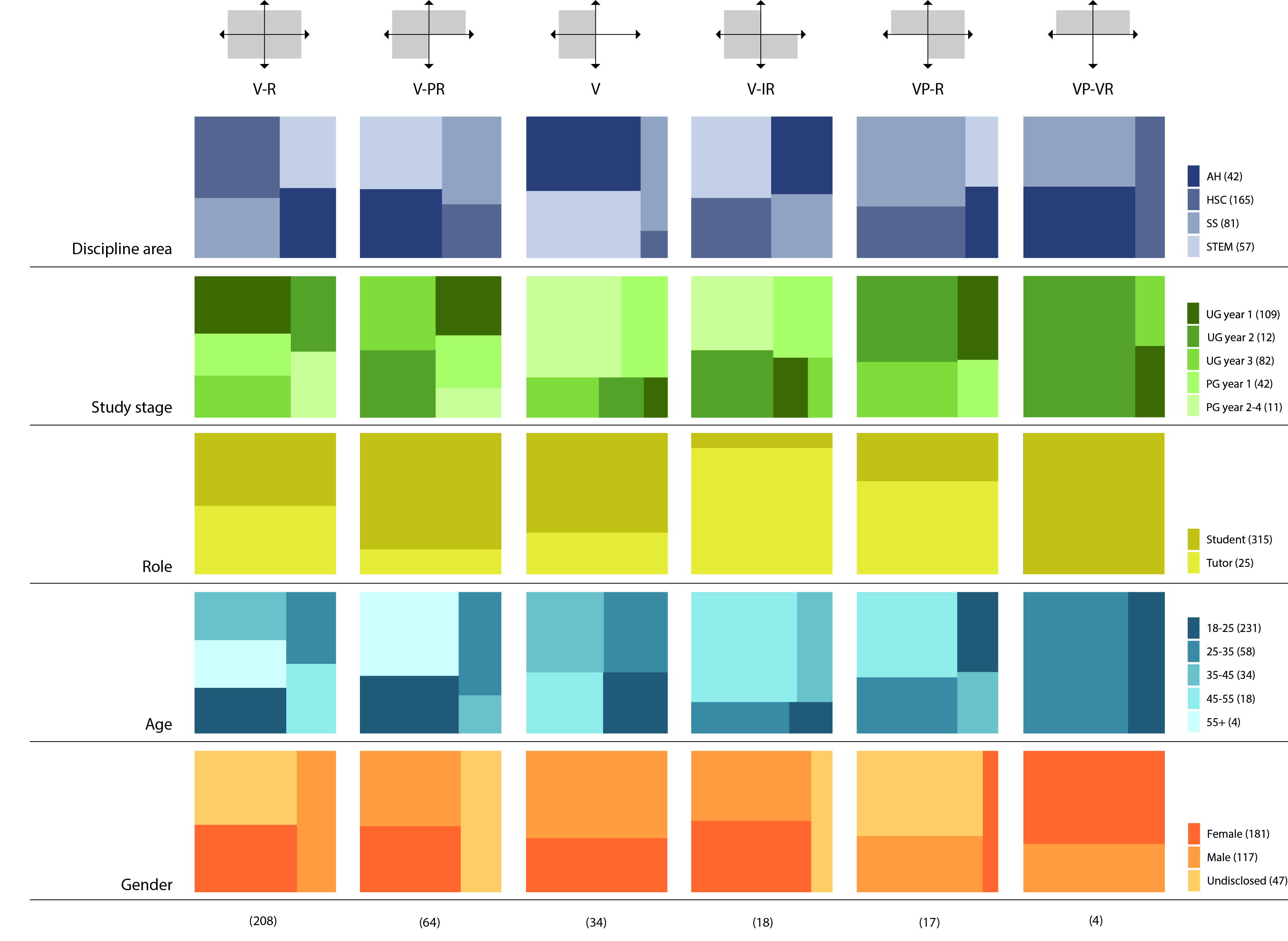
    Myself and Alison Le Cornu recently published “Using ‘Visitors and Residents’ to visualise digital practices” an open access paper reviewing the development of the Visitors and Residents idea. The paper describes the heritage of the V&R mapping process and details a visual pattern-based approach to clustering and analysing large groups of maps. This is a significant step as it expands the Visitors and Residents work beyond a discussion facilitating metaphor to a workable qualitative research instrument.

    At the heart of the paper is the presentation and analysis of data from a Higher Education Academy funded project which generated circa 400 V&R maps from staff and students at 18 higher education institutions from across the UK.

    From: Using ‘Visitors and Residents’ to visualise digital practices
    by David S. White and Alison Le Cornu.
    First Monday, Volume 22, Number 8 – 7 August 2017
    http://firstmonday.org/ojs/index.php/fm/article/view/7802/6515
    doi: http://dx.doi.org/10.5210/fm.v22i18.7802   – (Graphic design by Paul Tabak)

    I won’t rehash the description of the data collection and analysis here as that’s all in the paper, so do take a look if you are interested in using the V&R mapping as part of a qual data method.

    What’s rewarding is to have finally captured the narrative of the progression of the work from ‘a fun thing to do in a conference session’ to an innovative research instrument. Significantly, the Visitors and Residents narrative contains contributions from numerous friends and colleagues who have enriched the thinking and taken the work in new directions. For me this is a perfect example of the richness of working opening and posting CC licenced materials online for others to use and modify.

    I’m currently working with Ian Truelove on a version of the mapping which crosses the digital/physical space (locations) divide in teaching and learning. The mapping approach we are discussing includes ‘Independent’ and ‘Dependant’ for the vertical axis and the extension of Visitor and Resident metaphor into ‘hunter gatherer’ (Visitor) and ‘farmer’ (Resident). The plan is to use this with course teams to visualise and discuss how they provide ‘nutrition’ for students (and how they support students in developing their own, sustainable, forms of ‘nutrition’ – yes, this is a bit like the ‘give a man a fish – teach him to fish’ idea).

    The original description of V&R was largely based on ‘visibility’ or leaving a social trace. That doesn’t operate as well in physical environments where it is possible to be visible while in Visitor mode, for example, studying alone in the library. The hunter gatherer/farmer interpretation allows us to describe learner modes of engagement in both digital and physical environments.

    The vertical axis of Independent and Dependant draws out the important distinction between those times where teaching/technical/library staff are involved (this could be expressed as ‘contact’ time) and those times where students are working without direct input from staff. We have been careful to ensure that the digital/physical boundary is not tied to either axis as all modes of learning engagement can take place in either type of space.

    I’m keen to counter the idea that particular spaces (physical or digital) are intrinsically linked with a specific pedagogy. For example, while a lecture theatre does engender or encourage (partly through tradition) more didactic forms of teaching it can be used in many different ways (especially when digital spaces are incorporated into the face-to-face teaching). Similarly, Social Media as a genre of space does not mandate a particular form of dialogue or engagement. The new mapping process we are working on is designed to explore the relationship between spaces of all forms and modes of teaching and learning.

  • Truth and Method – a review of Visitors and Residents

    Recently I was invited to give a keynote talk as part of the research week at the Open University of Catalonia. Founded in 1994 it was the first fully online university. As you can imagine they have seen a lot of changes in the way people learn online and asked me to speak about Visitors and Residents (V&R) as a useful way of understanding online engagement. This gave me the opportunity to gather together some of the various uses of the idea that myself and others have developed.

    The Palau de la Música was our UOC dinner venue (much phone based image wrangling was involved in this image 🙂

    UOC did a nice job of videoing my keynote talk (if you have plenty of time – if not then read on)

    [embedyt] http://www.youtube.com/watch?v=eUH-FrPyBqc[/embedyt]


    You can find out about the ‘standard’ V&R mapping process here which is an effective method of making visible individuals’ engagement online. This process has been used by people in various contexts globally with one of my favourites being by Amanda Taylor with Social Work students. This starts from the principle that if we now, at least in part, live online then Social Workers need to be present in online spaces (or at least understand them as somewhere people are present).

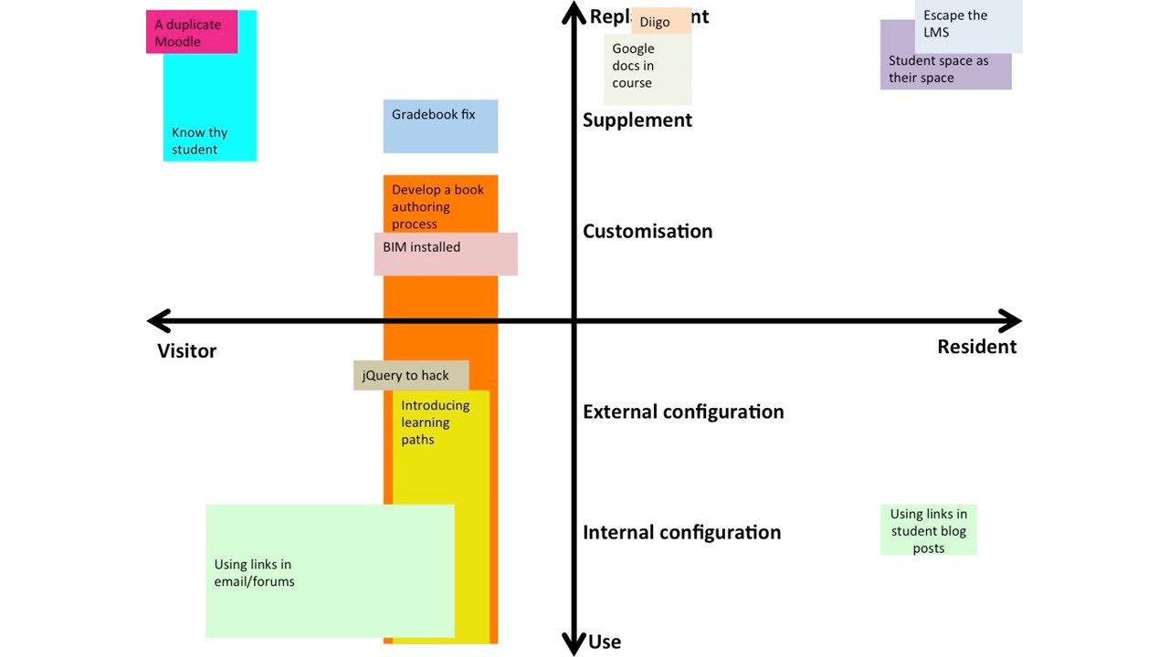
    Another interesting use of the basic mapping has been undertaken by the Mapping the digital practices of teacher educators project run by Peter Albion, Amanda Heffernan and David Jones. In an award winning paper they describe how they used a vertical axis on the map running from “Use” to “Replacement” to get teachers to map where they have used institutional platforms as they were intended and where they have reconfigured, customised or replaced them.  This is a great way of mapping the actual practice of an institution rater than assuming the technology is only being used along ‘official’ lines.

    From the paper presented at SITE’2016. One of three papers awarded the Ann Thompson TPACK Paper Award. Authors: Peter Albion, Amanda Heffernan, David Jones

    From the paper presented at SITE’2016. One of three papers awarded the Ann Thompson TPACK Paper Award.
    Authors: Peter Albion, Amanda Heffernan, David Jones

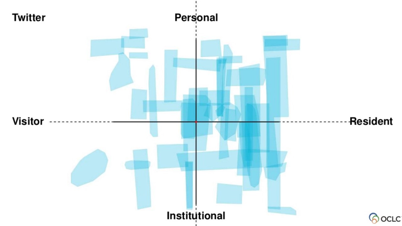
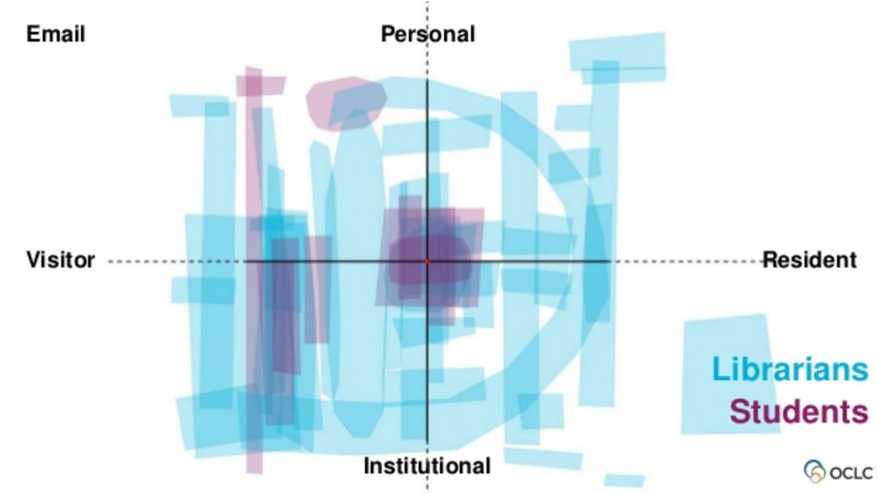
    The standard mapping process has also been used extensively by Lynn Connaway and colleges to explore how students engage with university services. A really interesting technique they are using is to extract each online tool/space to see how broad the modes of engagement are in specific groups. (The following slides were part of a presentation at the OCLC Global Council meeting, Building Our Future, April 12, 2016, Dublin, Ohio.)

    Connaway, L. S., & Harvey, W. (2016). Scaling learning: Learning about our users
    Connaway, L. S., & Harvey, W. (2016). Scaling learning: Learning about our users

    Note how Twitter maps across all four quadrants, not just the Resident side of the map.

    Connaway, L. S., & Harvey, W. (2016). Scaling learning: Learning about our users
    Connaway, L. S., & Harvey, W. (2016). Scaling learning: Learning about our users

    Here we can see that these students engage in email in a far narrower, less present, manner than the librarians which gives a useful insight into the manner in which the library should engage users online.

    OCLC are also developing an online V&R mapping app so that individuals can map digitally and the maps can be more efficiently analysed.

    This is where I come back to the “Truth and Method” title which is a reference to work by the philosopher Gadamer which Anthony Johnston, a colleague at UAL, recommended. It highlighted for me the tension between understanding practice individual by individual (Truth) and trying to uncover larger trends or themes across groups (Method). The mapping process originated as an activity for a conference session on the original V&R project. It’s gradually evolved down a number of branches into a research instrument designed to inform institutional strategy and policy. The work Lynn and OCLC is doing gathering together maps of specific services is a good example of how the process can be used to highlight trends.

    Another good high-level (Method) modification of the mapping process has been designed by Lawrie Phipps for Jisc. This is a ‘group’ or ‘institutional’ mapping process which has been used in a number of workshops (some run with the help of myself and Donna Lanclos) to help staff gain an understanding of the digital ‘landscape’ or identity of there institution.

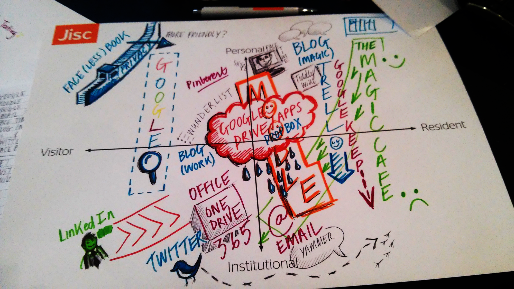
    Institutional map created at a Jisc digital leadership workshop. Lawrie has updated the process more recently, replacing Visitor and Resident with Broadcast and Engage on the horizontal axis
    Institutional map created at a Jisc digital leadership workshop. Lawrie has updated the process more recently, replacing Visitor and Resident with Broadcast and Engage on the horizontal axis

    I was lucky enough to attend a packed workshop on this at the Jisc digifest in March. The process works well, highlighting the balance between open content, stuff you need an institutional logon for and open engagement. In Lawrie’s version Visitor and Resident is swapped out for Broadcast and Engage which broadly map to V&R in principle but are a little more direct for folk who think along institutional lines. Significantly, the vertical axis is changed to Individual and Group to capture the location of identity the activity is linked to. For example, the main university website vs a individual academic on Twitter talking about their work.

    Jisc will be releasing detailed guides on running strategic V&R mapping workshops which include both the individual and group mapping formats.

    The art in research terms here is to develop methods which reveal larger trends across groups without sacrificing the ‘truth’ of individuals’ personal practices. It’s certainly the case that Web provides an environment where individuals can develop practices and modes of engagement which reflect their aspirations and context in an highly personal manner.  Every V&R map is different and everyone who maps can describe in detail why their map is a particular shape.

    Given that I’m wary of approaches which aim to take rich, qualitative data, and turn it into bar graphs. Sometimes numbers create a false truth, or perhaps I’m suspicious because I see numbers being used as if they are ideologically neutral. For example, we undertake interviews then code them and turn the coding into numbers. These numbers are then presented as a successful ironing-out of the idiosyncrasies of any given participant and any of our potential bias as researchers – is that really the point? In Gadamer’s view this would be Method winning out over Truth. Nevertheless we can’t respond as institutions on an individual by individual basis so we have tread a delicate path towards larger trends.

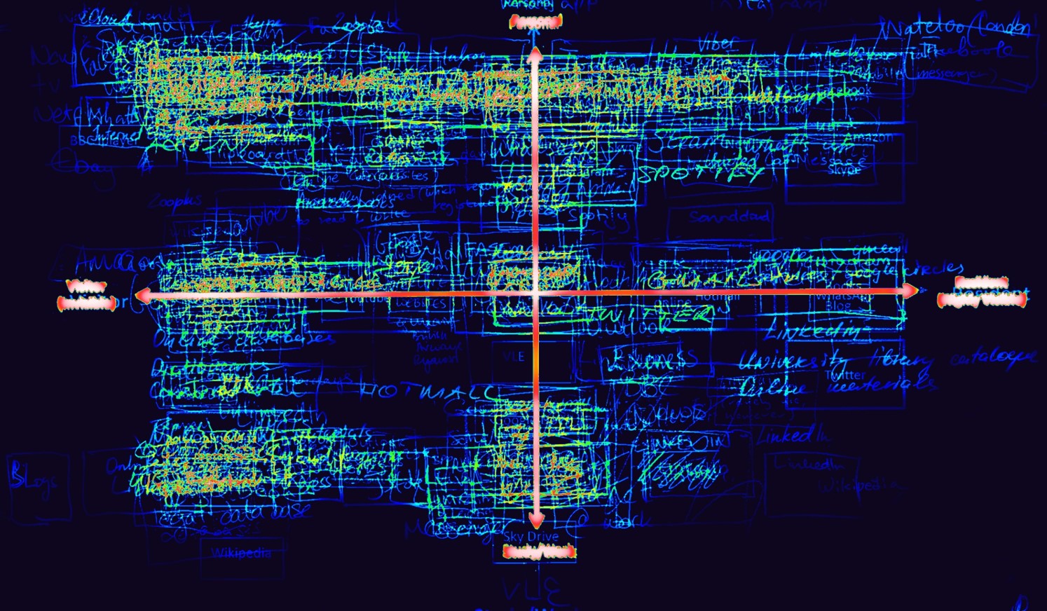
    My first attempt at this was to layer maps and create what I though of as a heat-map of a given group:

    V&R 'heat map'
    V&R ‘heat map’

    This one is of around 20 MBA students. It works ok because they all happened to map in a similar manner so you can see group patterns in the modes of engagement. The process is less effective when everyone is mapping in their own style. For example, how could you include the map below in a layered heat-map?

    An individual's map from a Jisc digtal leadership workshop
    An individual’s map from a Jisc digital leadership workshop

    So in attempting to create ‘accurate’ layered maps I was in danger of trying to smooth-out the charismatic and personal nature of them. You’d have to give people the same kind of pens and set a bunch of rules about how to map which takes away the interpretation of the process, it removes agency from the participant. This would be killing one of the characteristics of the mapping which I enjoy the most – seeing the person in the *way* they have mapped not just *what* they have mapped. In essence, the manner in which individuals approach the mapping is important data in of itself.

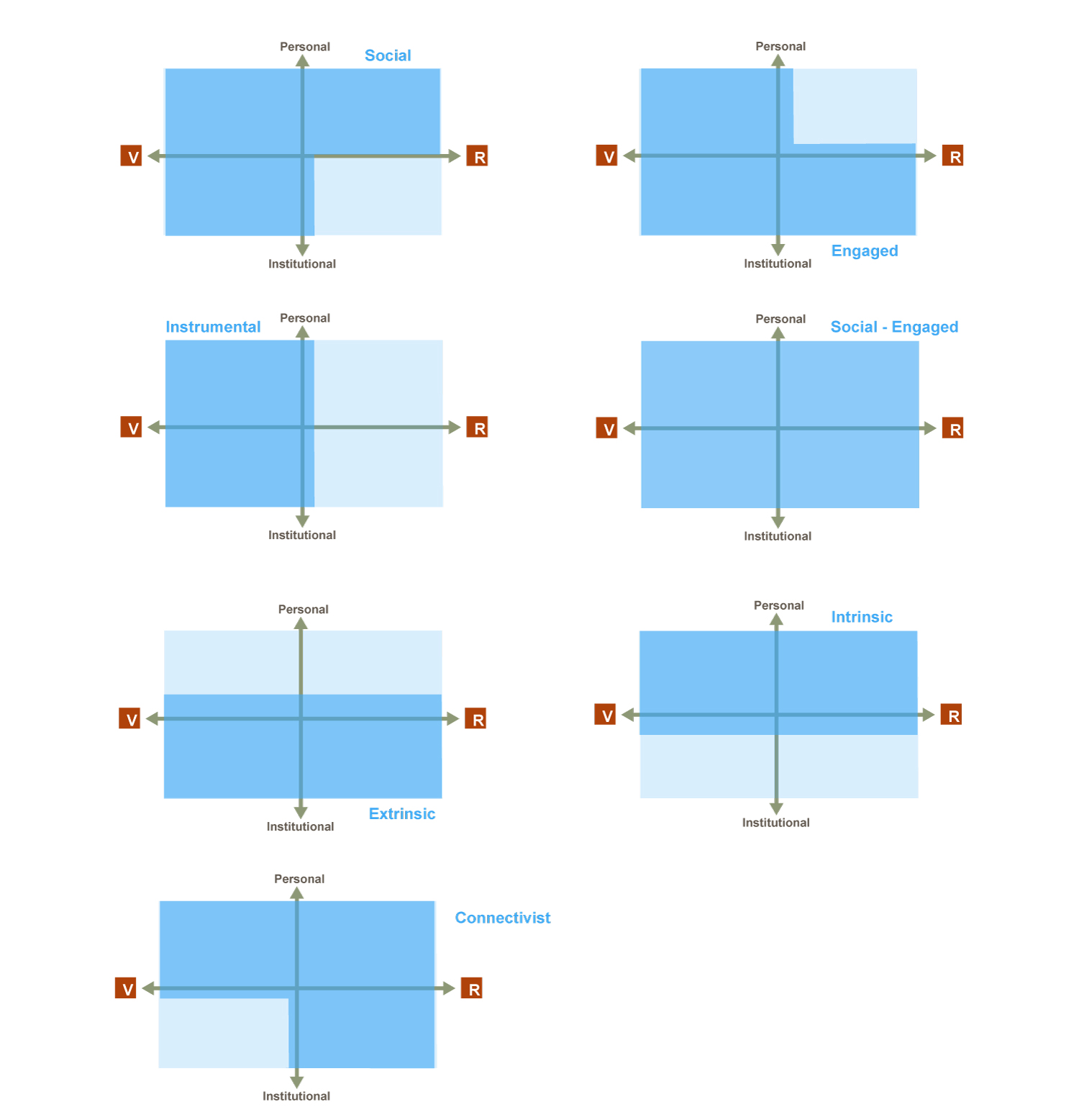
    I worked with Alison LeCornu on The Higher Education Academy ‘Challenges of Online Residency’ project which involved 18 higher education institutions mapping teaching staff and cohorts of students. From this I received circa 400 maps each tagged with participant data. Sifting through the maps it appeared that they did fall into broad categories based on the quadrants which had been mapped to. This led me to propose the following ‘engagement-genre templates’

    Templates

    The darker blue marks out the areas which an individual would have mapped to. The names of these templates aren’t hugely helpful as they are a little reductionist but, you know, naming.. etc. For example, I don’t want to imply that someone with a ‘connectivist’ map isn’t ‘engaged’.

    Having created the templates I set a colleague the fun task of reviewing all of the maps and tagging them along these lines whilst also discarding mappers who appeared to have utterly misconstrued the process (bad data). The result was pleasantly surprising – most maps do fall into one of the templates fairly neatly.

    Given that we were working form a convenient sample I normalised the results into ratios to look for trends. A few key patterns did emerge and it’s possible to interpret them in a manner which resonates with the narratives of higher education. We are currently writing up an open access paper on this so I won’t go into detail here.

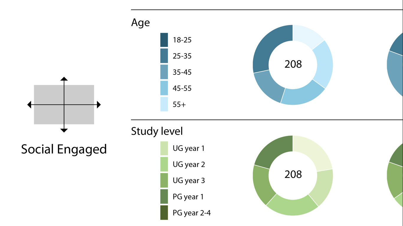
    One highlight worth mentioning in passing is the distribution of age ranges that had a ‘Social-Engaged’ map. This is a map in which there is activity in all four quadrants. The temptation might be to think that this form of map would skew young but the results show a fairly even spread of ages.

    Detail from the visualisation of the HEA project V&R map data


    This is the age bracket and educational level of the 208 ‘Social-Engaged’ maps in ratio form. Both these categories show even distribution, demonstrating again that age is not a significant factor in the overall mode of engagement of individuals online.  What we do need to be mindful of is that the character of activities undertaken across the maps might change significantly within a given genre template which is where capturing discussion that arises during the mapping process, undertaking follow-up interviews or asking participants to annotate their maps comes in to play. Nevertheless, I’m confident that using the templates is a valid approach and strikes a reasonable balance between Truth and Method when dealing with a large body of qualitative data.Hopefully we will have the paper written on this fairly soon and can share in more detail.

    Overall it’s been rewarding to see the various routes the V&R work has been taking. It’s a good example of the benefits of  working in an open manner and letting an idea evolve. One of the most pleasing outcomes from this approach is the V&R Wikipedia article which, for me, is a real vote of confidence in the value of the work.

    (please add, edit and update the article if you have been working with V&R – it needs work 🙂


  • Elegant Lurking

    One effective way to learn is to use Social Media un-sociably. The traditional term for this is Lurking – hanging around a discursive space online without speaking up. It’s an inherently negative sounding term with connotations of voyeurism and surveillance – a fundamental aspect of not being embodied online. For example, if you attend a lecture but  don’t ask a question you presumably aren’t Lurking because people can see you?

    Elegant Lurking
    CC – https://www.flickr.com/photos/gdiazfor/7538320058

    I’d like to propose the more positive notion of Elegant Lurking. This involves learners following key people in their disciplines (fellow students, ‘thought leaders’ practitioners, academics etc.) within Social Media to tune into the discourses within the subject. Often this is an effective way to discover interesting and valuable sources of information on a topic, especially those in formats which aren’t formally curated anywhere such as blog posts.

    The bonus for learners is the additional discussion around these sources which takes place when they are shared. Comment and opinion on the subjects tackled and the relative credibility of the author and/or the material itself are extremely useful when you’re new to a particular area. Elegant Lurkers are critically evaluating the critical evaluation of thinking in their area of study… part of which involves assessing the credibility of the people involved in the discourse.

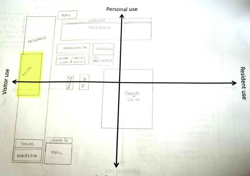
    The value of this mode of engagement has be highlighted by the various Visitors & Residents mapping workshops like the one we recently ran in Galway for Catherine Cronin. It’s common for individuals maps to contain a Resident style platform (Twitter, Facebook etc) in the Visitor side of the map. Often this is because the individual is Elegantly Lurking. They are not yet interested in being visible online in a learning context but they find watching the discourse very useful.

    V&R map

    A map from a 1st year Post-grad students in the Arts and Humanities. Note the position of Twitter at the visitor end of the continuum indicating ‘Elegant Lurking’ in a Resident style platform.

    All successful Social Media platforms allow for Lurking in some form. It’ allows individuals to tune into the ‘dialect’ of a particular network or community so that when they first decide to say something they’re reasonably confident it will be in an acceptable tone. Some learners will choose never to speak-up though, especially if they are following an intimidating network of venerable ‘thought leaders’ or if they assume they won’t be responded to. Others might find that they gain confidence over time as they come to understand the discourse in greater depth and discover that they do have something to say.

    I’ve seen this numerous times where a student or someone new to a field signals that this is the ‘the first time I’ve commented on this’ or ‘I’ve written my first post on this subject and thought you might be interested’. This is an extremely important transition point for a learner from knowledge-consumer to active community member. It’s the point at which they are exploring their ‘voice’ within the discourse.

    Supporting students to move towards this transition should be central to the overall trajectory of our pedagogy in more nuanced ways than simply assigning marks to the act of blog posting. Elegant Lurking is an important ingredient in the subtle business of becoming a member of a community.

    This also highlights the mercurial nature of what it means to ‘engage’. The Elegant Lurker can be much more engaged than the noisy contributor and not being visible doesn’t mean you aren’t present. I worry that in the race towards quantifying engagement via analytics the more gentle, qualitative modes of engagement such as Elegant Lurking will be overlooked.

  • Think Less – Find More

    This is an idea I’ve been musing over for a while and regularly encounter in different contexts. The phrase ‘Think Less – Find More’ is my suggested strap line for Google search as it’s essentially what they are selling. Obviously this isn’t how they market their search service but it is in essence the message they are giving to users. The evolution from keyword to natural language searching and the increasing use of user data to tailor results is part of a drive towards answering (in part) your information ‘needs’ before you even know you have them (I’m thinking of Google Now here).

    Think
    CC – https://www.flickr.com/photos/erikeckel/2133261517

    In the Visitors and Residents research project one of the questions we asked participants (students ranging from late-stage secondary school all the way through university) was “If you had a magic wand what would be the ideal thing you’d want to help you learn”. A common answer could be characterised as “Something which highlighted the best information and the right answers”.  For example one student described a library type scenario in which the most useful books would glow in response to a question.

    Unknowingly to our participants what many of these responses boiled down to was “I’d like Google to work perfectly” by which they meant that the top search results would be ‘correct’ so they wouldn’t have to spend time evaluating them or cross checking. So what we might describe as the process of research (evaluating and synthesising a range of sources into a cogent narrative or argument) they were thinking of as ‘what you have to do because the technology doesn’t quite work properly yet’. They had been sold Think Less – Find More.

    I’m not saying that Google is evil or that these students were misguided, my point is that this is the culture we need to respond to in education.  Our pedagogy is still based in Dewey Decimal times while our students (and staff) are actually operating in a radically different knowledge environment. If we take into account the Think Less – Find More culture shift this is a huge opportunity for us as educators. Google allows us to shift from knowledge transfer mode and concentrate on helping students to develop their ability to think. How we managed to create an education system which doesn’t have this as its central tenant is a mystery to me…

    If we redesign teaching incorporating the Web we will be nurturing agile and powerful thinkers who can build on the power of abundant information rather than leaving them to worry that going online is tantamount to ‘cheating’.


    I talk about Think-Less Find More and ‘Currencies of Credibility’ in this video:

  • Mapping online engagement

    Back in June I wrote a post about the Visitors and Residents mapping process. Since that posting I have run mapping sessions with people in various roles from a range of institutions.  This has helped me to refine and simplify the process.

    During those sessions I got requests to produce a V&R mapping kit that people could use to run the process with groups at their institution. I haven’t got as far as I would like with that yet but in the meantime I have extracted the most relevant 10 minute segment from the original mapping video. I’m hoping that anyone who watches this extract will have all the info they need to create their own map.

    A single engagement map is all that is required for an individual and should drive a useful discussion if the mapping is done in a group situation. It should also be useful to then create a map of your department/library/project/group. This way you can assess the digital footprint (The character and visibility of your group online) of your section of your institution and the various modes of engagement you may, or may not, be using. It’s worth noting that if you are mapping with students some of them may relate better to the word ‘course’ instead of  ‘institutional’ on the vertical axis of the map.

    I have collated a few maps from various people (including my own from the video) on this Padlet wall so you can get a sense of how varied the process can be depending on the context of the individual:
    http://padlet.com/wall/visitorsandresidents

    The maps on the wall have no commentary attached to them to preserve anonymity.

    The mapping process originates from research funded by Jisc

  • V&R mapping at Educause

    What I was first reminded of at Educause 2012 in Denver was how much money is tied-up in educational technologies. The Expo was a daunting journey into the world of CIO budget power – the kind of issues my research makes visible did not appear to be top of the agenda. I fended off my feelings of alienation with the reflection that the attendees of this conference were exactly the kind of people who I should be ‘disseminating’ our findings and approach to. This was not going to be cosy preaching-to-the-converted situation in which we got to discuss the esoteric side of becoming-a-legitimate-participant, digital fluency or the shifting nature of credibility on the web. Add to this the fact that our session was scheduled for 8am on Friday and you can probably see why I was expecting a handful of participants who may have accidently wandered into the wrong room.

    Denver
    My view of Denver

    I was encouraged somewhat though by the number of people who approached me to discuss the challenges of ‘MOOCing’ the Humanities after my question on this to Harvard’s CIO who was speaking about edX. (I’m not saying that projects like edX aren’t game changers but they seem to have confused experimenting with business/access models with ‘revolutionising learning’. At least that’s how the presentation came across.)

    Friday, 7.30AM – and myself, Donna Lanclos & Lynn Connaway were so focused on trying to find enough dry-wipe markers for our session that we didn’t notice the room filling-up. By the time we were due to start we had about 60 people and some of them looked fairly awake.

    Mapping
    Proof that some people were awake while ‘mapping’

    In the room were Heads of elearning, Deans, Library Directors, Senior Learning Technologists etc. People who are paid to make high-level strategic decisions about the approach of their staff and institutions.

    The format of our session was very interactive: Starting with a brief overview of Visitors and Residents (the project and the idea) and then straight into attendees mapping their own personal engagement with the web on the Visitor/Resident–Personal/Institutional quadrant. I had shown a version of my engagement map created in a Google Drawing and put my Gmail address up on screen in the hope that people might share their maps. Almost everyone got stuck into the exercise and against my expectations over the next 15 minutes a few Google drawings did arrive along with a couple of photos of whiteboard maps. This meant we could talk through the results of the activity on the main screen using some examples drawn from the room. We had gone from outlining the Visitors and Residents idea to producing and discussing participant’s modes of engagement with the web in less than 30 minutes. It was the ultimate workshop turnaround and it got people talking because we had quickly moved from discussing an idea in the abstract to deconstructing the actual engagement behaviour of those in the room.

    We then asked the attendees to map the engagement of their ‘clients’ (e.g. academics, student, researchers, library users etc.) with the services they provided in their institutions. Again I received a couple of Google Drawings which led to a brief discussion about the challenges of providing institutional services that are designed to engage in a Resident mode. In hindsight we could have done with about 20 minutes longer but I felt we had cracked the Visitors and Residents workshop format. We certainly got good feedback, including one participant who said that if we could put the workshop format online he could use it “all the time” at his institution. I started to wonder if we should extract the mapping elements of the proposed Visitors and Residents course and post them as a do-it-yourself workshop format.

    During the hour after the session I received a few more personal engagement maps in a variety of formats, Google Drawings, pics of whiteboards/notepads and an Evernote Skitch. I gathered some of these together on the plane home:

    Educause V&R maps
    Educause – Personal V&R maps

    Full-size version

    There is a wealth of intriguing information here but the aspect which is most immediately striking and which came out during the session is how the same platforms are engaged with in a variety of ways. To demonstrate this I have highlighted the location of Facebook across the maps.

    V&R maps with Facebook highlight
    V&R maps – Facebook highlighted

    Full-size version

    This didn’t come as a surprise to me as the data from our Visitors and Residents project shows that many people use Facebook privately (Messaging or 1-to-1 IMing) or organisationally (keeping track of friends/colleagues but not posting or communicating via the platform). This supports one of the original tenets of the Visitors and Residents idea which is that discovering *what* technology people use does not give an insight into *why* they are using it or even, it would appear, what they are actually doing.

    Skype & IM
    V&R map – Skype and GTalk highlighted

    Full-size verison

    A pointed example of this can be seen in the most detailed map submitted wherein the functionally equivalent technologies of Skype and GTalk are mapped to different places because they are being used as a method of keeping certain areas of life compartmentalised (as an attempt to fend off personal/institutional convergence, or the ‘decompartmentalision’, that tends to be a side effect of Residency)

    It was very rewarding to see the Visitors and Residents idea being used as a tool for reflection and planning. I hope that many of the relatively senior people who attended our session will be taking V&R thinking back to their institutions. I felt it was worthwhile equipping some of the Educause delegates with this approach as it should prove to be a useful way for them to understand their students/clients when they are bombarded with claims about efficiency, student retention and ‘intuitive’ platforms at the next big edtech expo.